•
MELO App Design
•
The MELO app design process focused on understanding user needs, developing personas, and mapping a seamless user journey. From lo-fi wireframes to a refined UI, we integrated personalized elements and a cohesive visual style, creating an intuitive app that guides users through their emotional well-being journey.
Early Brainstorm
Our journey with the MELO app began with an extensive brainstorming session aimed at understanding the core challenges faced by our target users—teenagers, young adults, and white-collar workers dealing with anxiety. We delved into identifying the stress triggers prevalent in these groups, such as high-pressure work environments, social and economic pressures, and the increasing influence of social media.
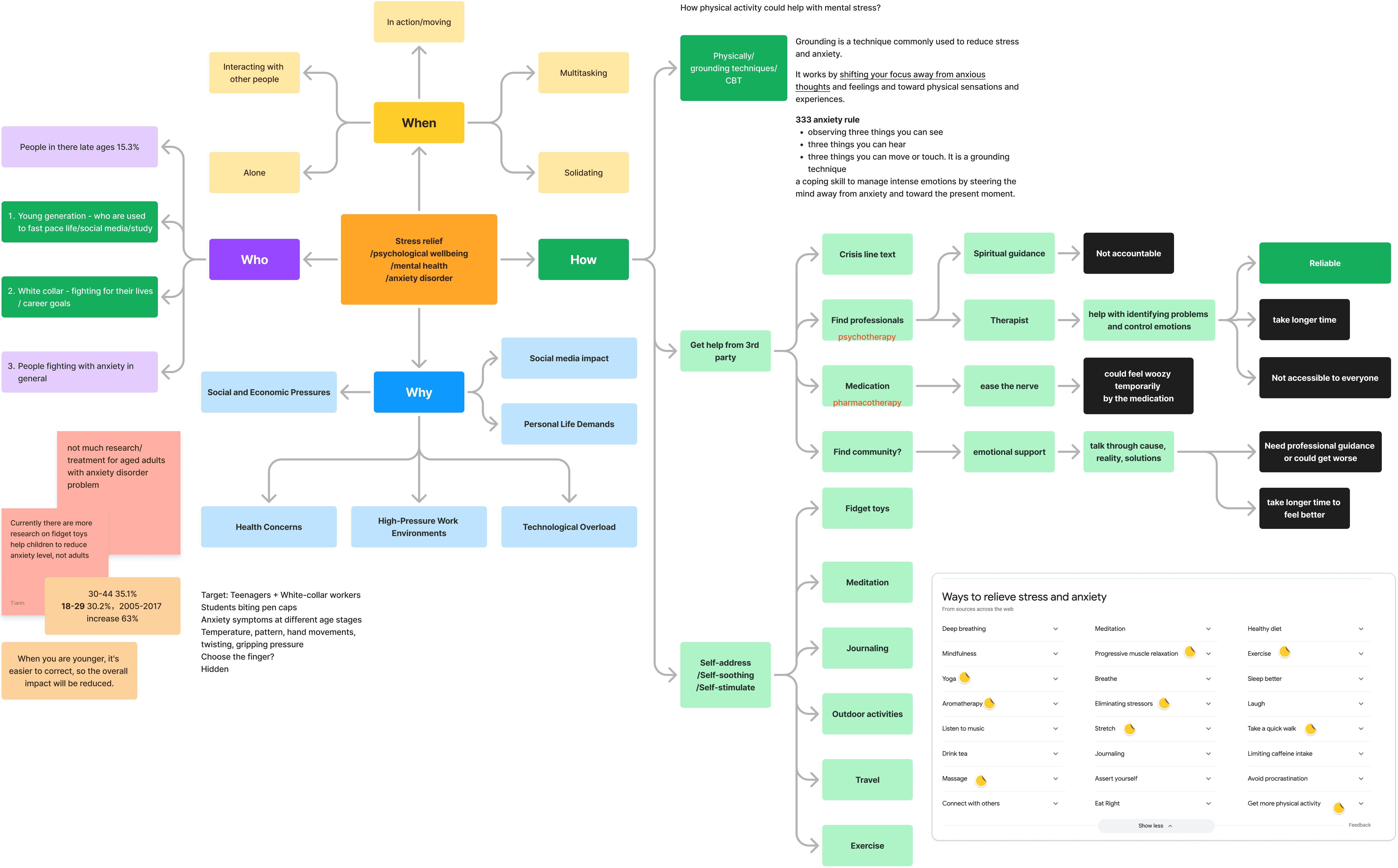
Recognizing the unique symptoms of anxiety at different life stages, we focused on developing a solution that could cater to both physical indicators like hand movements and temperature changes and emotional factors like a need for grounding techniques. By exploring various methods for self-soothing and stress relief, from physical activity to meditation and professional guidance, we laid the foundation for creating a comprehensive tool that could provide personalized support in navigating the complexities of mental well-being.
Crafting User Personas
To better understand our target audience, we developed two detailed personas: Alex Johnson and Emily Davis.
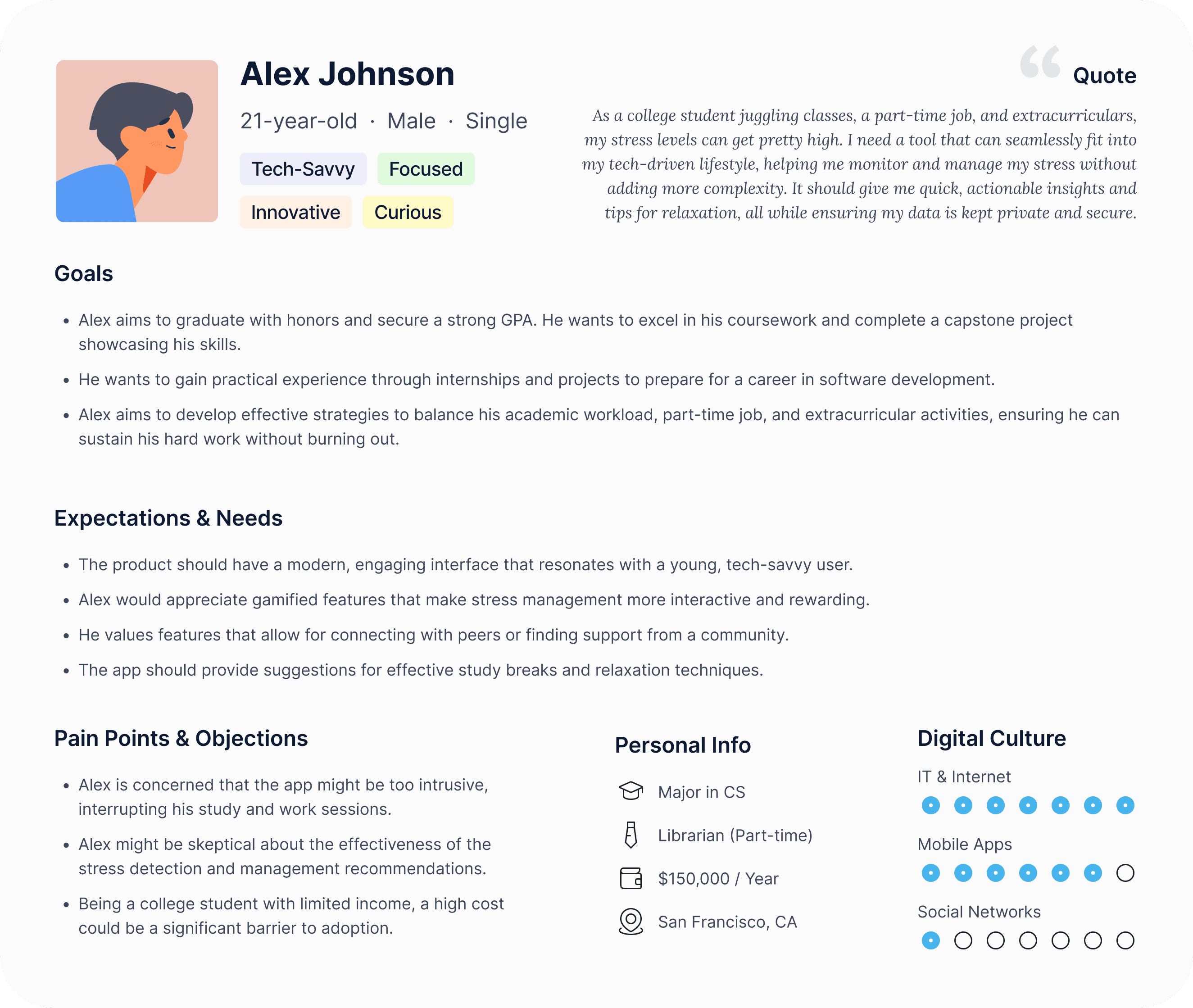
Alex is a 21-year-old tech-savvy college student balancing his studies, part-time job, and extracurricular activities. His focus is on finding practical ways to manage stress without disrupting his fast-paced, tech-driven lifestyle. Alex values a modern interface, gamified stress management features, and opportunities to connect with peers.
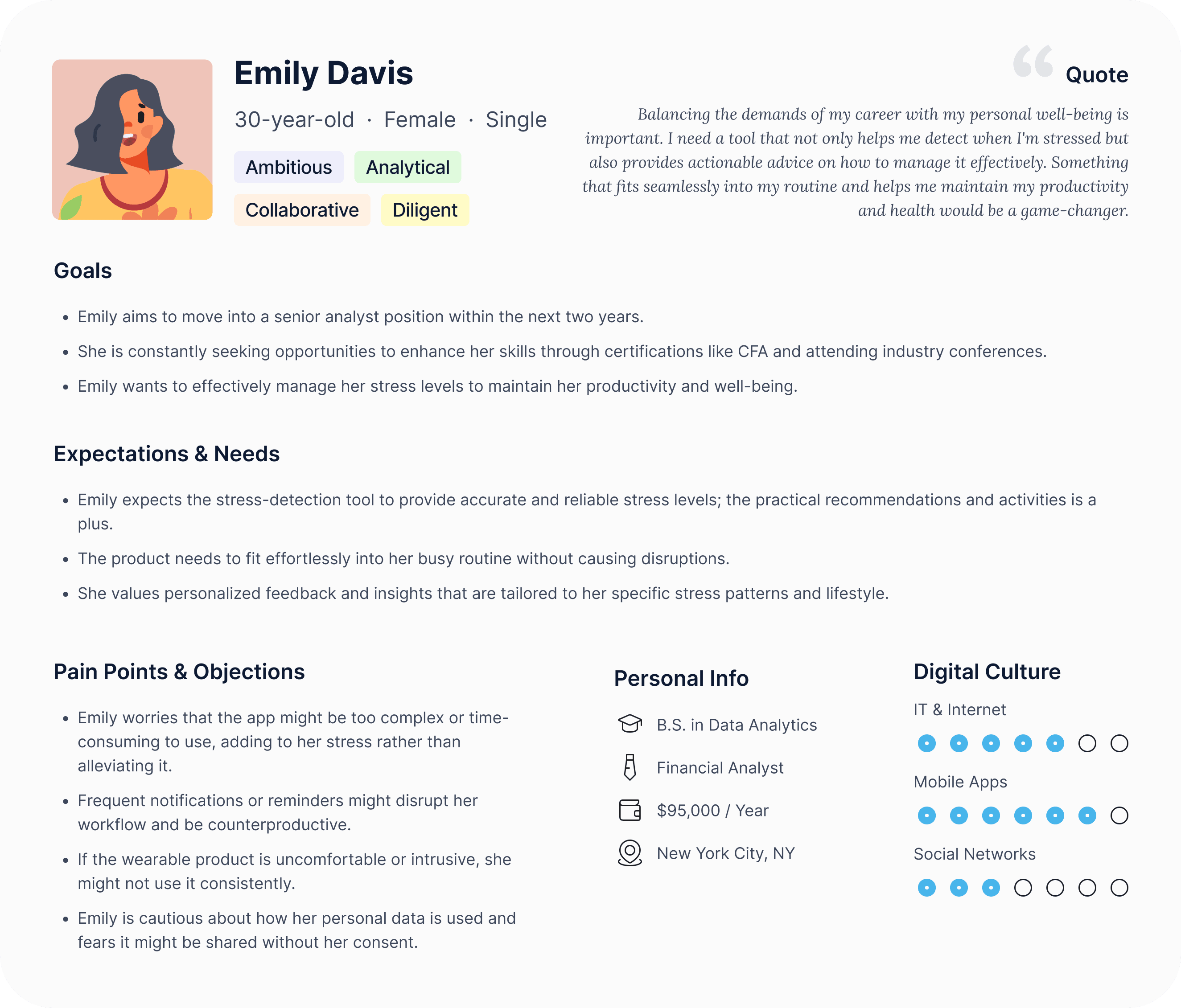
Emily is a 30-year-old ambitious financial analyst, constantly seeking to advance her career while maintaining her well-being. Her needs center on a seamless, non-intrusive app that fits into her busy schedule, offering personalized insights and practical recommendations for managing stress. These personas guided our design decisions, ensuring that the MELO app addresses the specific challenges and expectations of both younger users and professionals.
Mapping the User Journey
Our next step in the design process involved creating a comprehensive user journey map to better understand the experiences and challenges our users may encounter with the MELO Bubble Ring and app. This map outlines each phase, from initial interest in the product to daily interaction and long-term engagement. We identified key touchpoints where users might face friction, such as during the onboarding process, setting up preferences, and receiving real-time results. We also highlighted areas of opportunity to enhance user engagement, like personalized recommendations, seamless app integration, and providing educational content on stress and mental health.
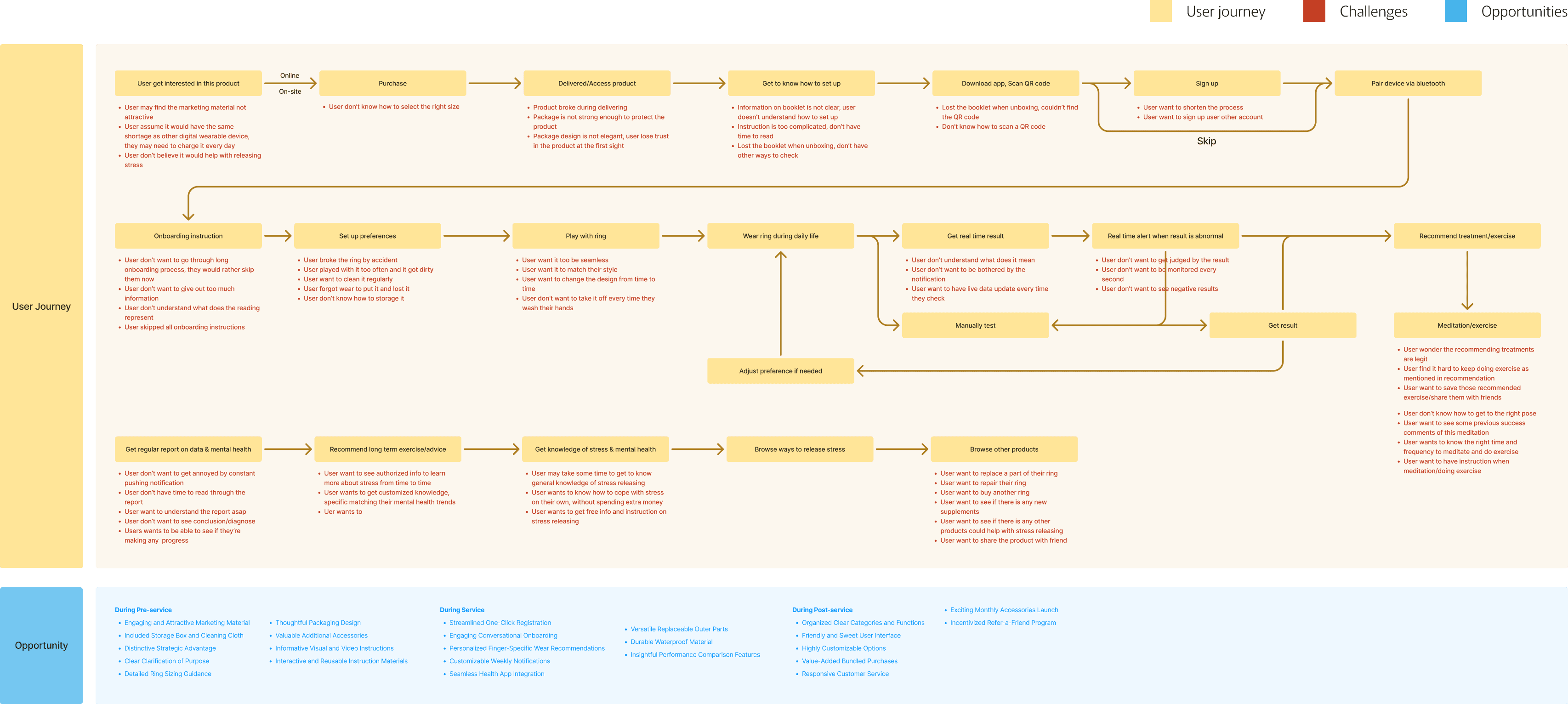
Through this comprehensive mapping process, we were able to pinpoint areas where we could improve user satisfaction, including simplifying onboarding and offering more user-friendly app interactions. The insights gained from this journey informed the design and functionality of both the ring and the app, ensuring a smoother, more intuitive experience.
Structuring the User Experience
In the MELO app design process, we developed a comprehensive site map to ensure a logical and seamless user experience.
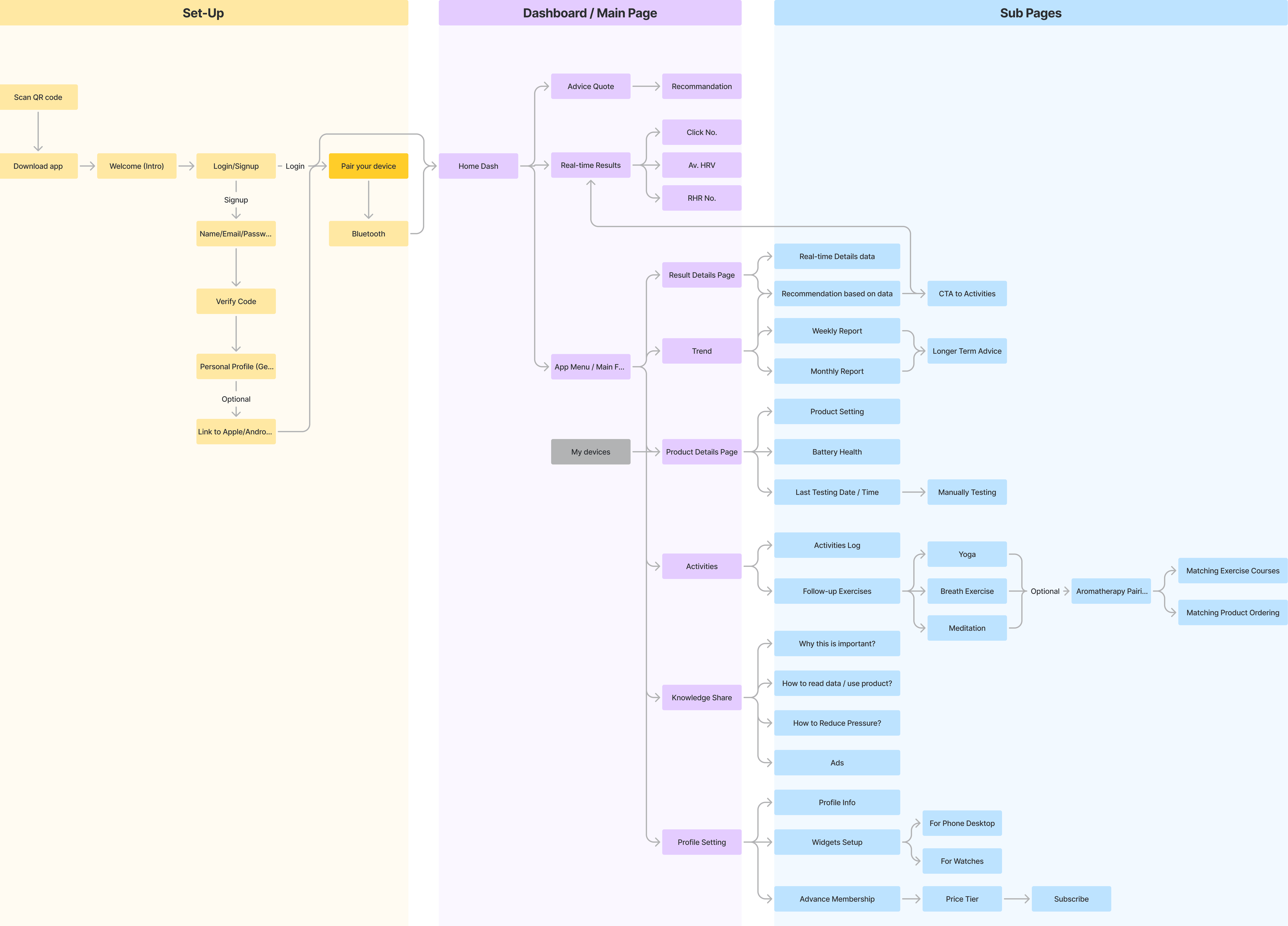
The site map outlines each step of the app's functionality, starting from the setup phase to the main dashboard and deeper into detailed subpages. It acts as a blueprint for navigating through the app, making sure that every feature and function is easily accessible to the user.
The setup flow guides new users through app installation, login, and device pairing with straightforward steps to reduce friction during onboarding. From there, the main dashboard serves as the central hub, providing real-time insights, personalized recommendations, and activity tracking at a glance. The subpages offer more in-depth information and controls, including data trends, activity logs, and health insights, catering to users who wish to dive deeper into their progress.
Lo-Fi Wireframes
We started with lo-fi wireframes to map out the core structure and user flow. These wireframes acted as a blueprint, allowing us to focus on functionality and user interaction without the distraction of detailed design elements. We outlined every crucial step of the user journey, from onboarding to activity tracking and progress reports.
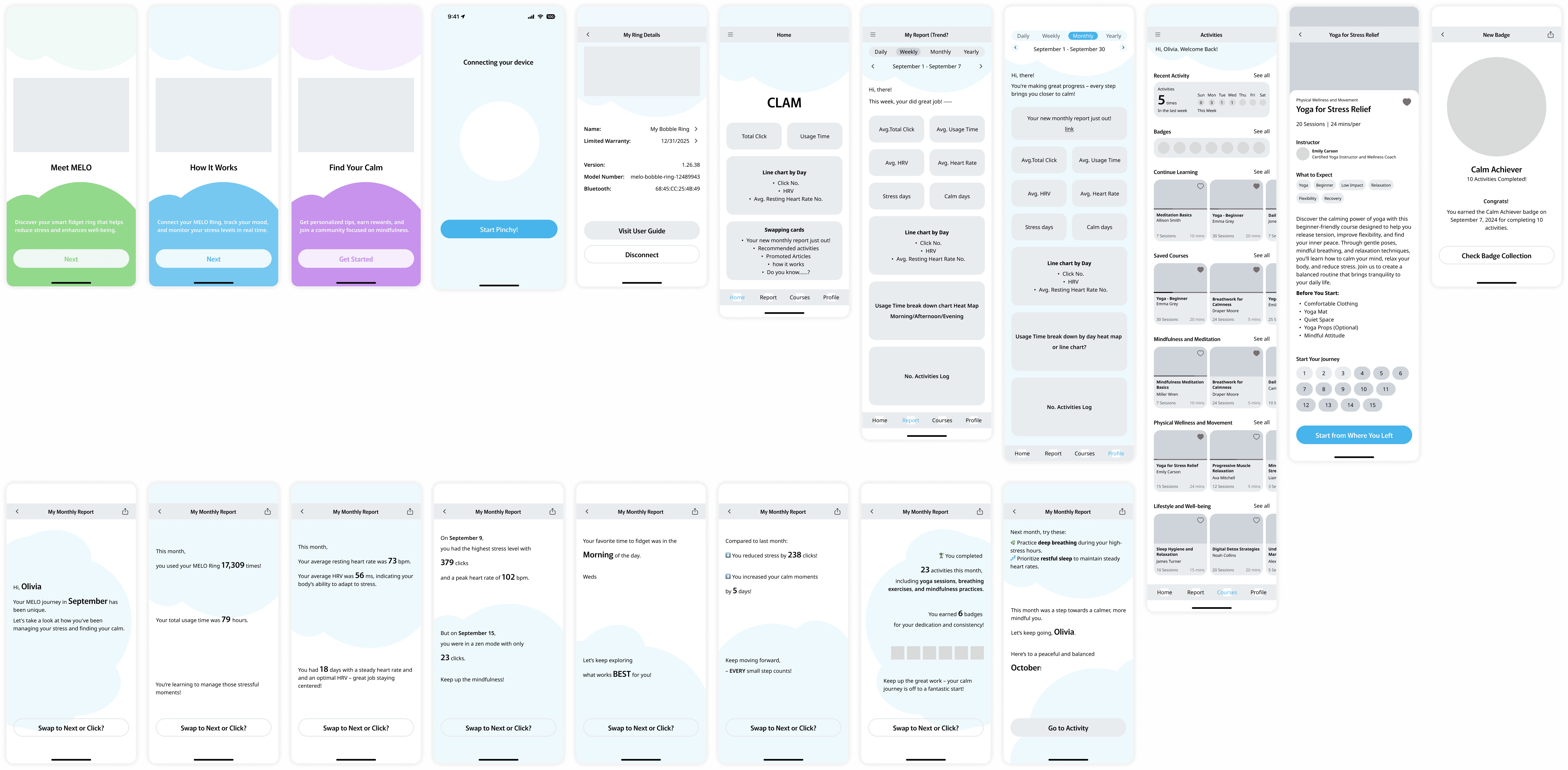
The lo-fi wireframes provided a clear view of how users would navigate through the app, interact with the features, and access the information they need. We meticulously planned each screen to ensure that the layout was intuitive, the user flow was seamless, and the essential information was easily accessible. This stage was all about refining the app's architecture to create a solid foundation for the upcoming design phases.
Design Guide: Typefaces and Brand Colors
After solidifying the app's structure with our lo-fi wireframes, we turned our attention to building the visual language of the MELO app by creating a comprehensive design guide.
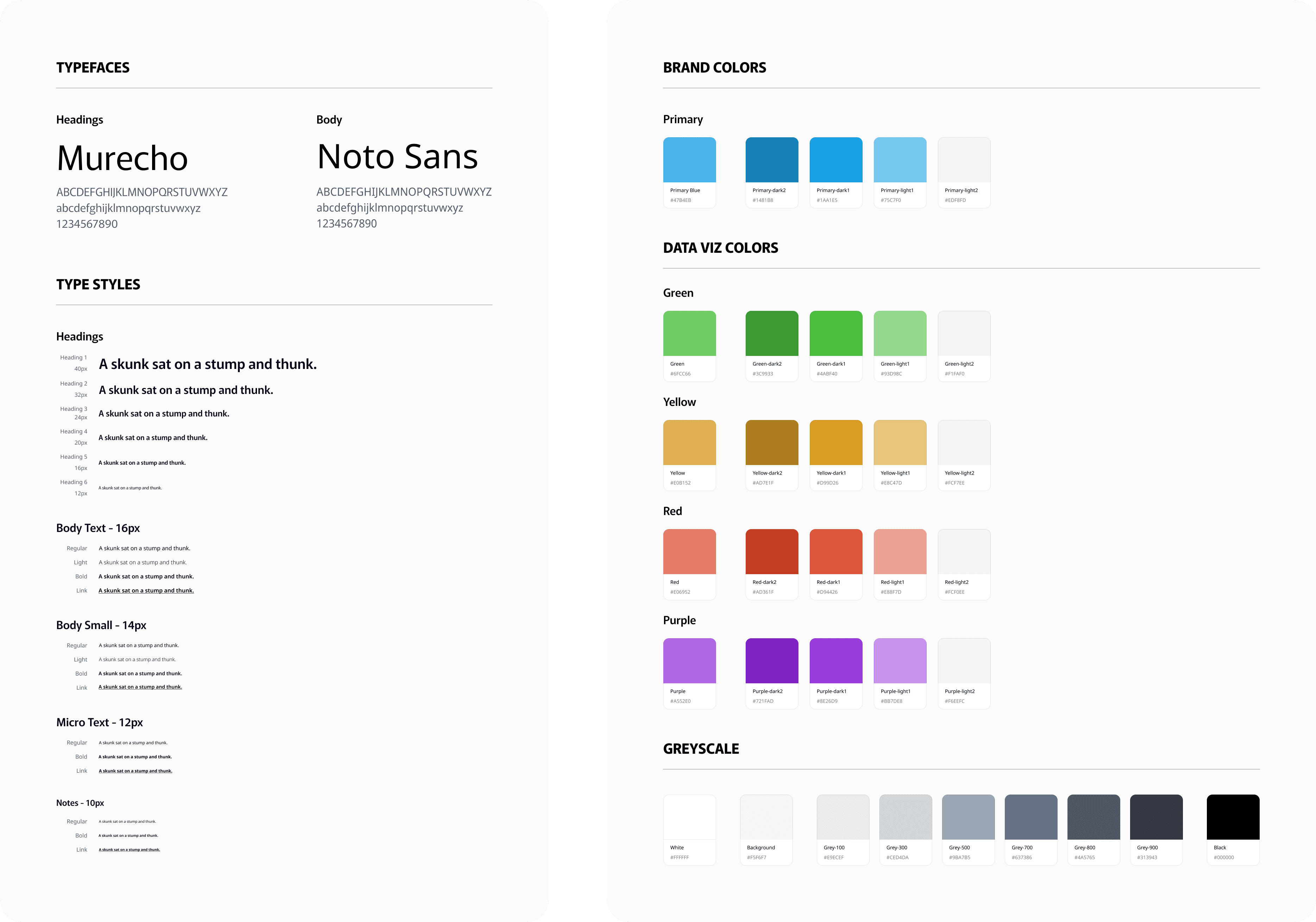
For typefaces, we selected Murecho for headings, with its modern and clean lines that deliver a sense of professionalism, and Noto Sans for body text, known for its readability and versatility. The pairing of these fonts balances the app’s design, making it accessible and easy to navigate while maintaining a sleek and contemporary feel.
Our brand colors were carefully curated to resonate with the emotional spectrum that MELO addresses. We developed a color palette that reflects each level of the user's mood journey, from the calming blues to the energizing greens and warm yellows, ensuring that each hue communicates a specific emotion.
Branding
The MELO logo design is a direct evolution of our character, which itself was inspired by the playful shapes of the ring's fidget top.

We took the unique form of the fidget top, transformed it into our character, and then refined it into the logo—creating a seamless connection between the product's physical essence and its digital representation. This progression from fidget top to character to logo symbolizes our commitment to making the app experience both tangible and relatable.
As for the brand name, MELO is more than just a title—it's a reflection of our mission. Derived from the first letters of Mindful Engagement, Less Overwhelm, it encapsulates the app’s core purpose: to help users engage with mindfulness while easing the burden of stress. Through this thoughtful naming and design process, we crafted an identity that ties together the visual and conceptual elements of our project, making it meaningful and memorable for users.
First Draft of App UI
We incorporated our brand colors and characters in this initial MELO app UI draft.
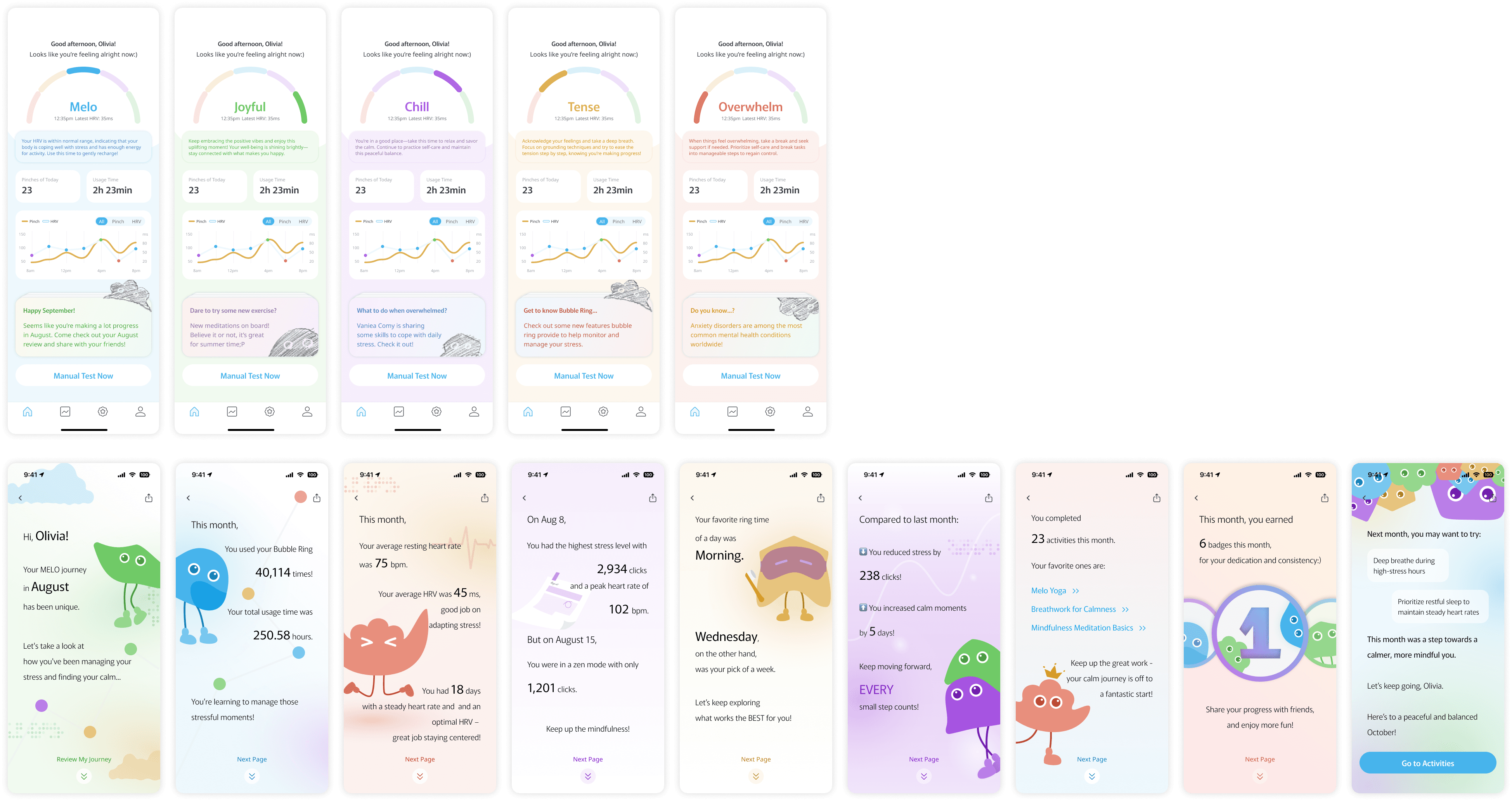
However, we identified areas for improvement. The color hierarchy needs refinement, as some elements blend together, making it hard for users to distinguish key actions. Additionally, the text hierarchy requires enhancement to ensure important information stands out clearly.
Final Version of App UI
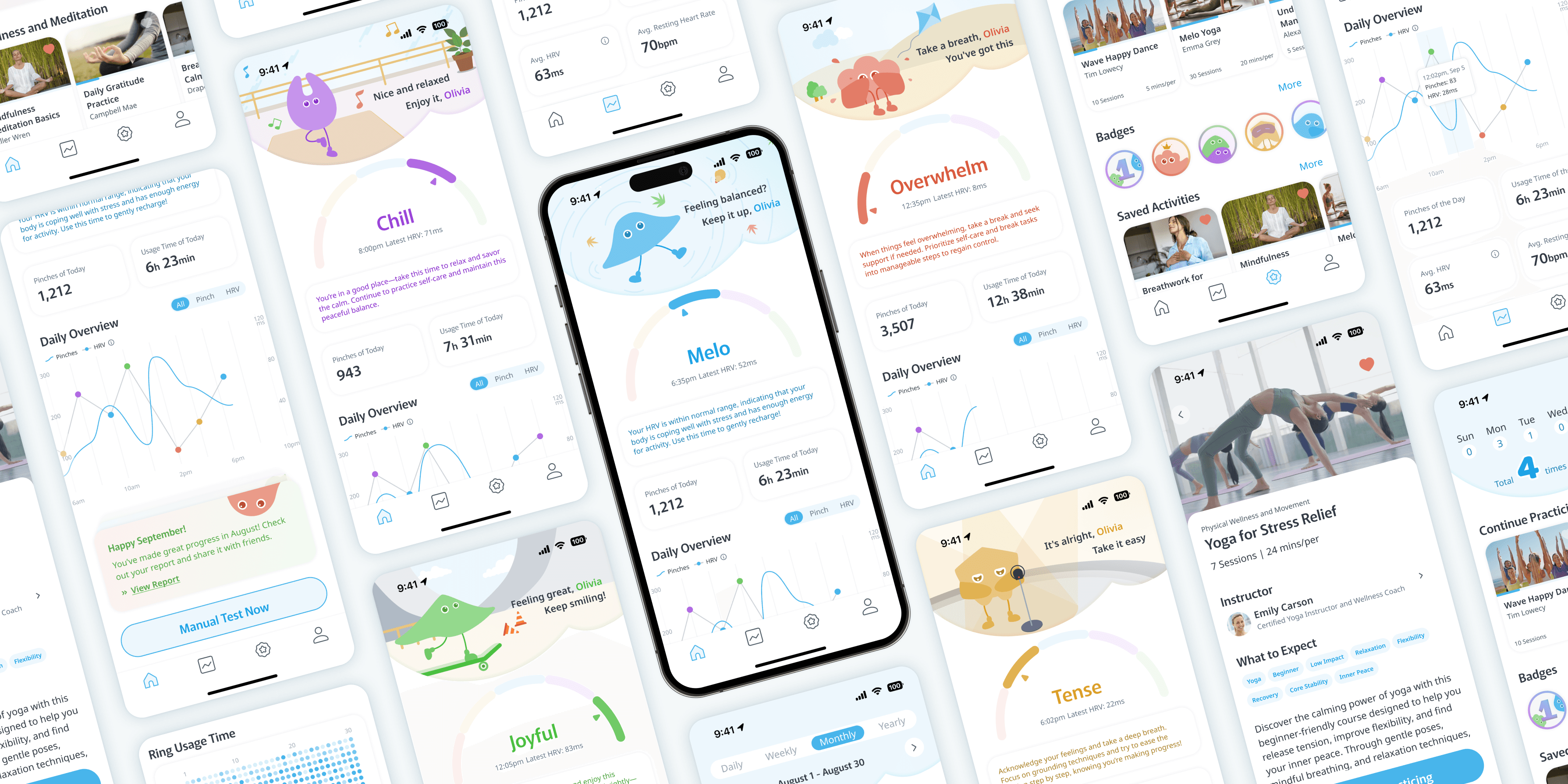
The final iteration of the MELO app UI focuses on delivering a seamless and intuitive user experience by fully integrating our character-driven design with refined visual elements. We aimed to create an interface that is not only engaging but also provides users with a clear and personalized path to manage their stress levels and emotions. Through this cohesive design, we strived to enhance user interaction with our mood-tracking tools while maintaining a balance between functionality and aesthetics.
Home Screen Overview
The home screen of the MELO app serves as the central hub for users to track their emotional well-being in real-time. The screen is designed to adapt to the user’s current mood, represented by our characters in various emotional states—Overwhelm, Tense, Melo, Chill, and Joyful. Each state comes with supportive messages and suggestions, creating a personalized experience that guides users toward relaxation and stress management.
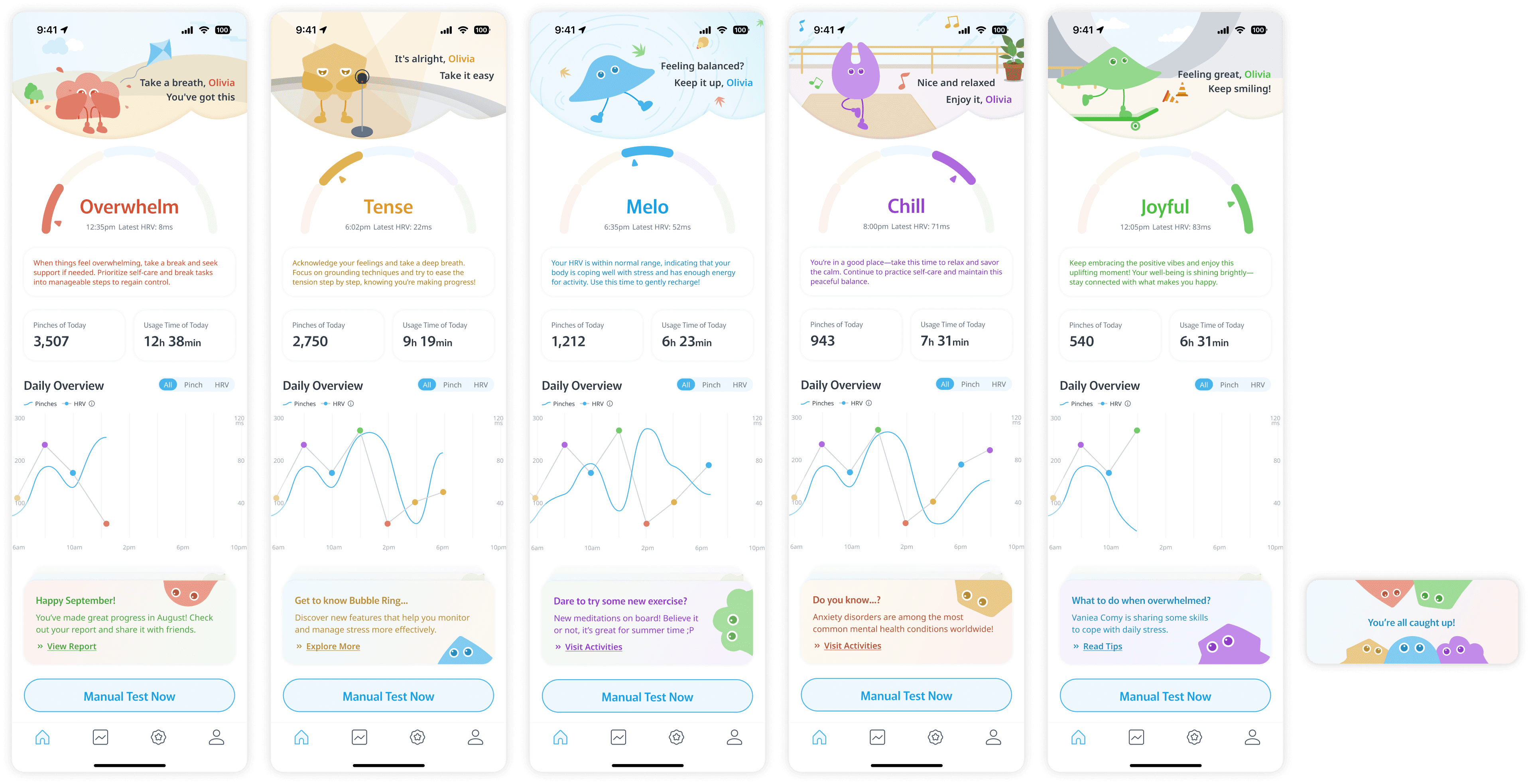
Key information like usage time, daily pinch activity, and heart rate variability (HRV) are displayed clearly, allowing users to monitor their emotional and physical states at a glance. The "Daily Overview" chart provides insights into pinch and HRV patterns throughout the day. Users are also encouraged to take proactive steps with the "Manual Test Now" button and informative cards that suggest new activities and tips to maintain emotional balance. This final design elevates the app’s usability by prioritizing clarity, engagement, and personalized guidance.
In-App Reports and Summary Insights
The MELO app's in-app reports provide users with a holistic view of their emotional well-being by offering daily, weekly, and monthly insights.
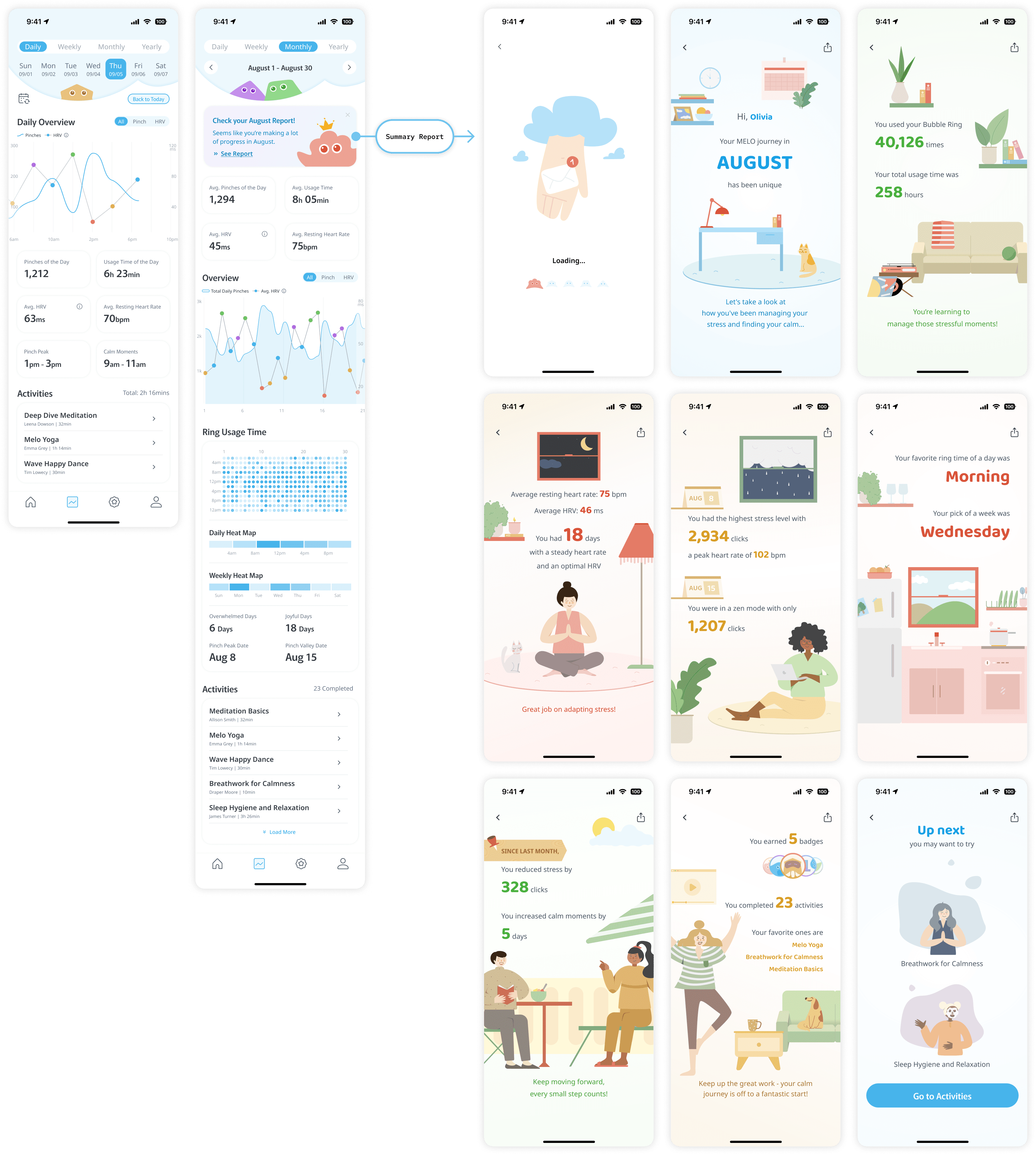
Our detailed charts display essential metrics such as pinch activity and heart rate variability (HRV) trends, alongside usage time and calm moments. The pinch activity chart tracks the frequency of pinches throughout the day, visualizing how stress levels fluctuate in real-time. This helps users identify peak stress periods and recognize patterns in their behavior. HRV data is also presented clearly to indicate the body’s stress response and resilience, providing users with insights into their physiological state.
The app also features heat maps to represent peak pinch times, showing when users tend to feel most stressed or relaxed. Weekly and monthly summaries offer a deeper analysis of these metrics, highlighting trends over time and drawing attention to days with significant emotional highs or lows. This approach enables users to understand their triggers, adjust their activities, and make informed decisions to manage their stress levels effectively. By focusing on these key metrics, the MELO app equips users with the knowledge to take proactive steps toward improving their emotional health and well-being.
From the monthly report screen, users can delve deeper into their journey by accessing the summary report. This feature offers a snapshot of their achievements, challenges, and emotional progress for the month. The summary report highlights milestones like peak stress days, moments of calm, and total ring usage time, guiding users with personalized suggestions to maintain a balanced emotional state. By transforming data into actionable insights, the MELO app empowers users to take charge of their wellness journey with clarity and confidence.
Activities
The activity section of the MELO app is designed to keep users engaged and motivated on their wellness journey.
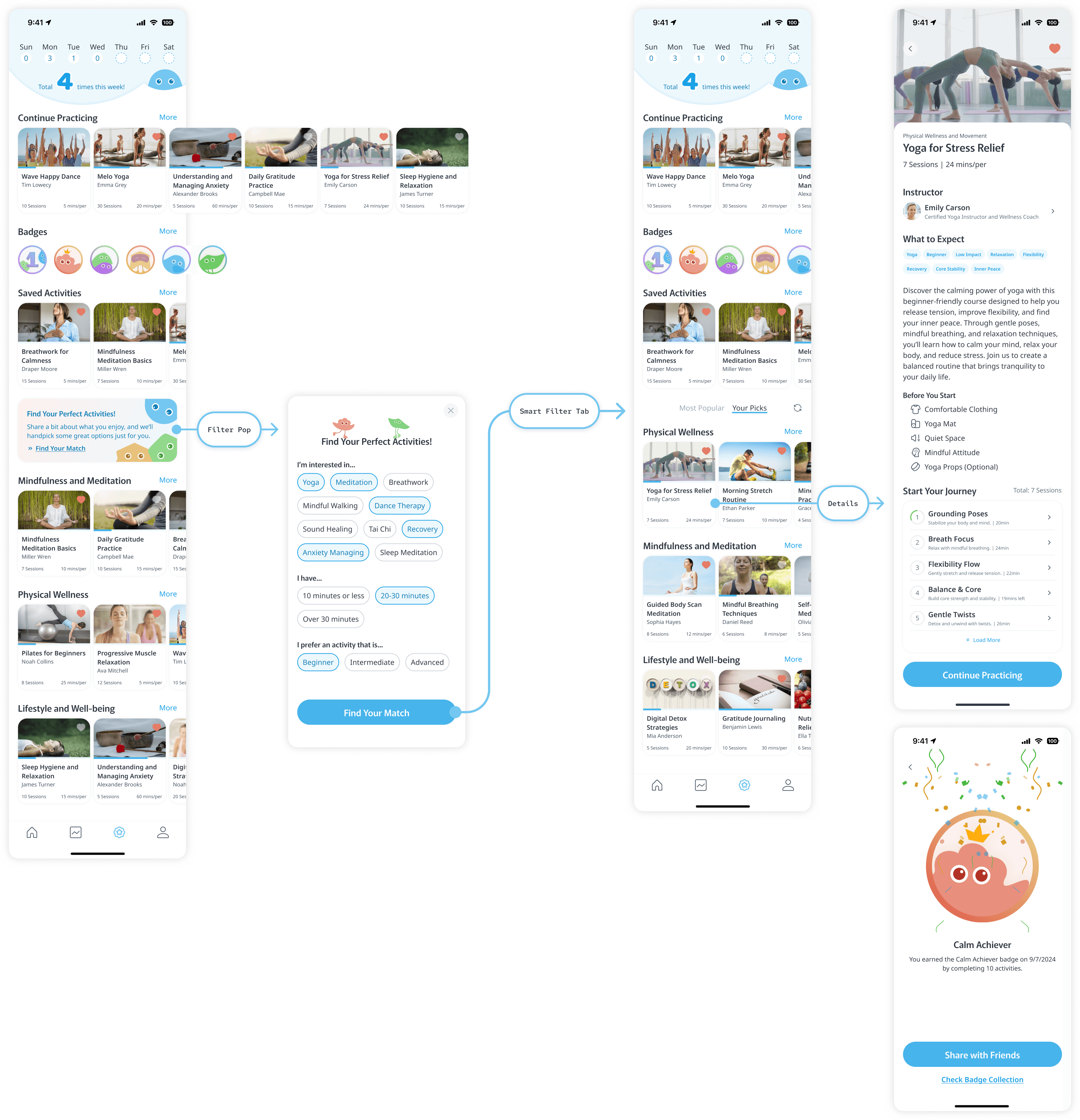
At the top of the main activity page, users can see a summary of how many activities they've completed this week, providing a sense of progress and achievement. This feature encourages consistency and helps users track their dedication to improving their mental and physical well-being.
We also introduced a badge system that rewards users for reaching milestones and achieving their wellness goals. These badges serve as both a celebration of their efforts and a visual reminder of their growth, motivating them to stay committed to their journey.
To ensure a personalized experience, new users can set up their preferences through the "Find Your Match" card, selecting specific types of activities they’re interested in, as well as preferred durations and skill levels. This smart filter can be reset or updated at any time by clicking the reset icon next to the "Your Picks" tab, allowing users to adapt their recommendations as their needs evolve.
Each activity in the MELO app has a detailed description that provides guidance on what to expect, required materials, and the benefits of the session. This thorough approach empowers users to select activities that fit their current mood and goals, enhancing their overall experience and helping them make informed decisions on their path to wellness.
