•
IP Design Story
•
The MELO Bubble Ring IP design evolved from the ring’s fidget top shapes into engaging characters, representing different mood states. These characters were refined and personalized, then seamlessly integrated into the MELO app to enhance the user experience.

Inspiration
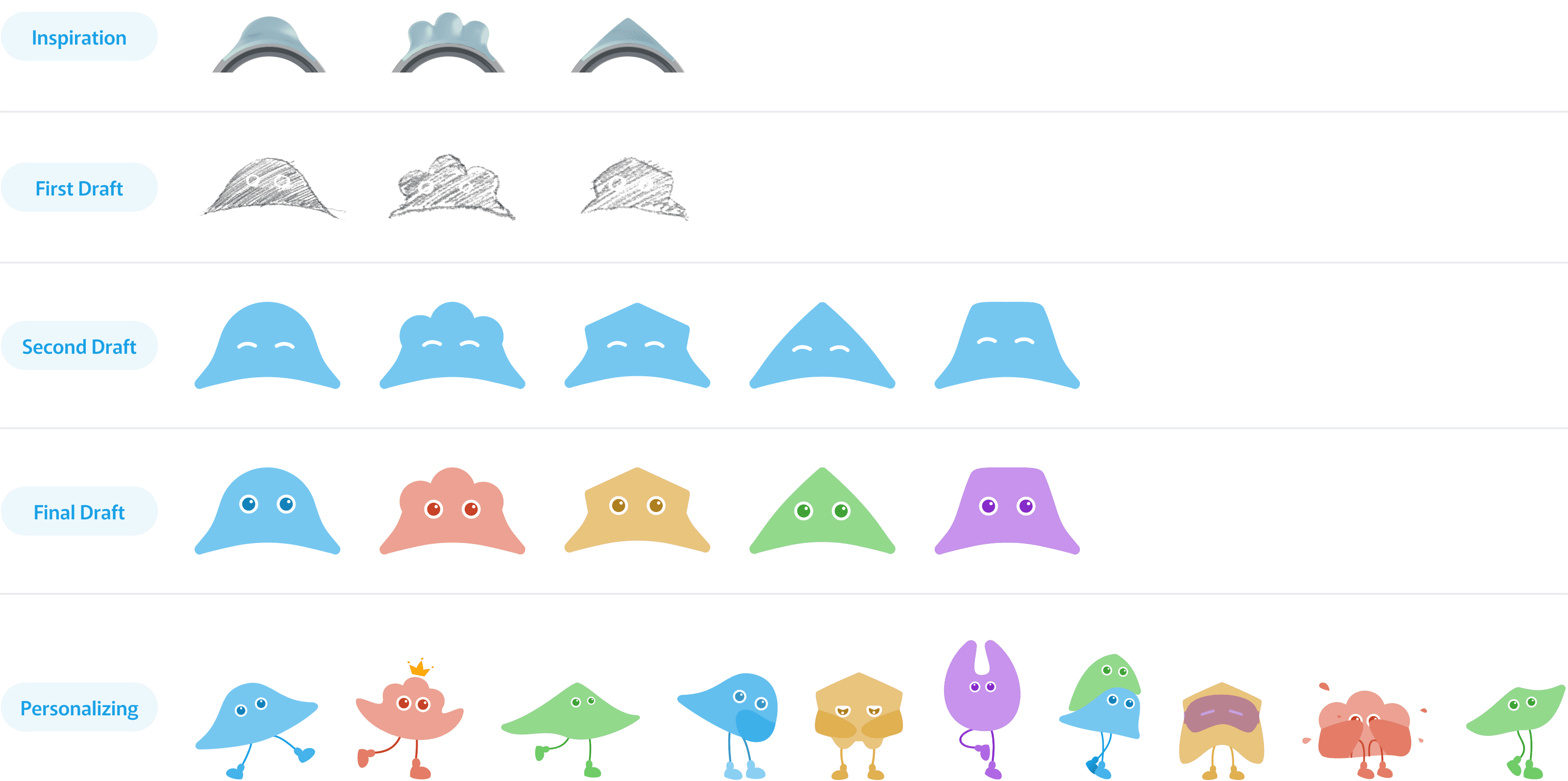
Our journey began with the simple shapes of the fidget tops on the MELO Bubble Ring. These shapes inspired the foundation of our character designs, as we sought to create forms that were both engaging and reflective of the playful essence of the ring itself. By using the natural curves and geometries of the fidget tops, we laid the groundwork for characters that could resonate with users and convey a sense of movement and interaction.

From Sketches to Personalization
First Draft
In the first draft, we translated the core shapes into initial sketches. Our focus was on creating a variety of expressive forms that could easily adapt to different emotions while maintaining the simplicity of the original fidget tops. This stage was all about exploration—defining the character’s visual personality and testing the boundaries of their shapes.
Second Draft
Building upon the sketches, the second draft saw these forms come to life with more refined details and distinct facial expressions. We introduced subtle variations to each character’s shape, experimenting with how their features could express a wide range of emotions while staying true to their geometric origins. This phase was crucial in ensuring that our characters were relatable and engaging.
Third Draft
In the third draft, we focused on defining the characters’ identities and solidifying their emotional expressions. We expanded the color palette to align with the five mood levels of the MELO app, each color representing a specific state of mind—from Joyful to Chill, Melo, Tense, and Overwhelmed. This visual language allowed the characters to reflect the user’s emotional journey intuitively.
Personalizing
Finally, we personalized each character by adding distinct actions and playful touches that brought them to life. This stage was where the characters truly became representations of user emotions, with their movements and expressions designed to adapt dynamically. By infusing them with personality and tying their behaviors to the app’s functionality, we transformed them into companions that guide and support users on their wellness journey.
Crafting Five-level Emotional States
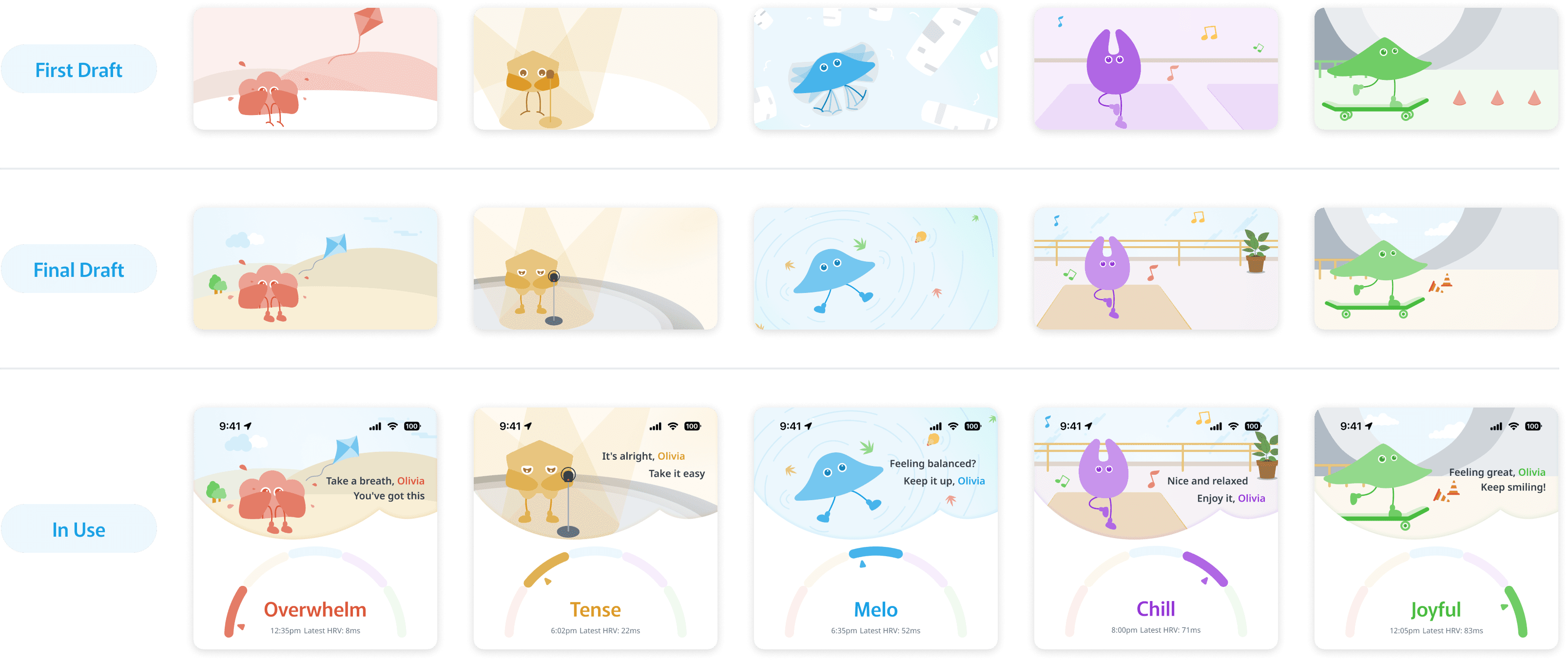
Creating the hero header images for the MELO app's mood levels was a journey of thoughtful design and storytelling. Our goal was to bring the emotional states to life by placing each character into relatable scenarios that resonate with users’ daily experiences. From the first draft to the final implementation, every detail was crafted to visually represent the journey from feeling overwhelmed to joyful.
We started with rough sketches in the first draft, refining the scenes in successive iterations until we arrived at the final, polished illustrations. Each image was then seamlessly integrated into the MELO app interface, allowing users to instantly recognize and connect with their current mood.
Our design journey focused on making each emotion relatable and visually distinct, so users could easily navigate their emotional states and find personalized content that resonates with their current experience.

Overwhelm – Losing a Kite
For the Overwhelm state, we depicted the character losing control of a kite on a breezy day. This visual metaphor of struggling to keep hold of something perfectly captures the feeling of losing grip on stressors and the resulting sense of overwhelm.
Tense – Presentation Spotlight
The Tense mood was illustrated by placing the character under a spotlight as if they were in the midst of a high-stakes presentation. The stage setting conveys the pressure and anxiety that come with public speaking, a situation many people find tense and nerve-wracking.
Melo – Swim Backstroke
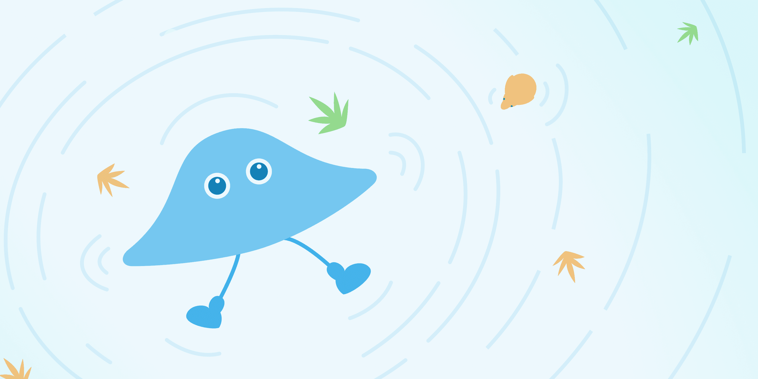
To express the balanced and stable state of Melo, we illustrated the character doing a calm swim backstroke. This imagery reflects a sense of rhythm and flow, signifying being in control and at ease, gently moving through the currents of life.
Chill – Yoga Session
Chill was brought to life by depicting the character in a peaceful yoga session. This scene emphasizes relaxation, mindfulness, and inner peace, as yoga is often associated with grounding oneself and finding a tranquil state of mind.
Joyful – Skating Adventure
The Joyful mood is represented by the character confidently skating. The dynamic movement and joyful expression convey a sense of freedom, playfulness, and happiness, capturing the peak of emotional well-being.
Integrating IP Characters into the MELO App Experience
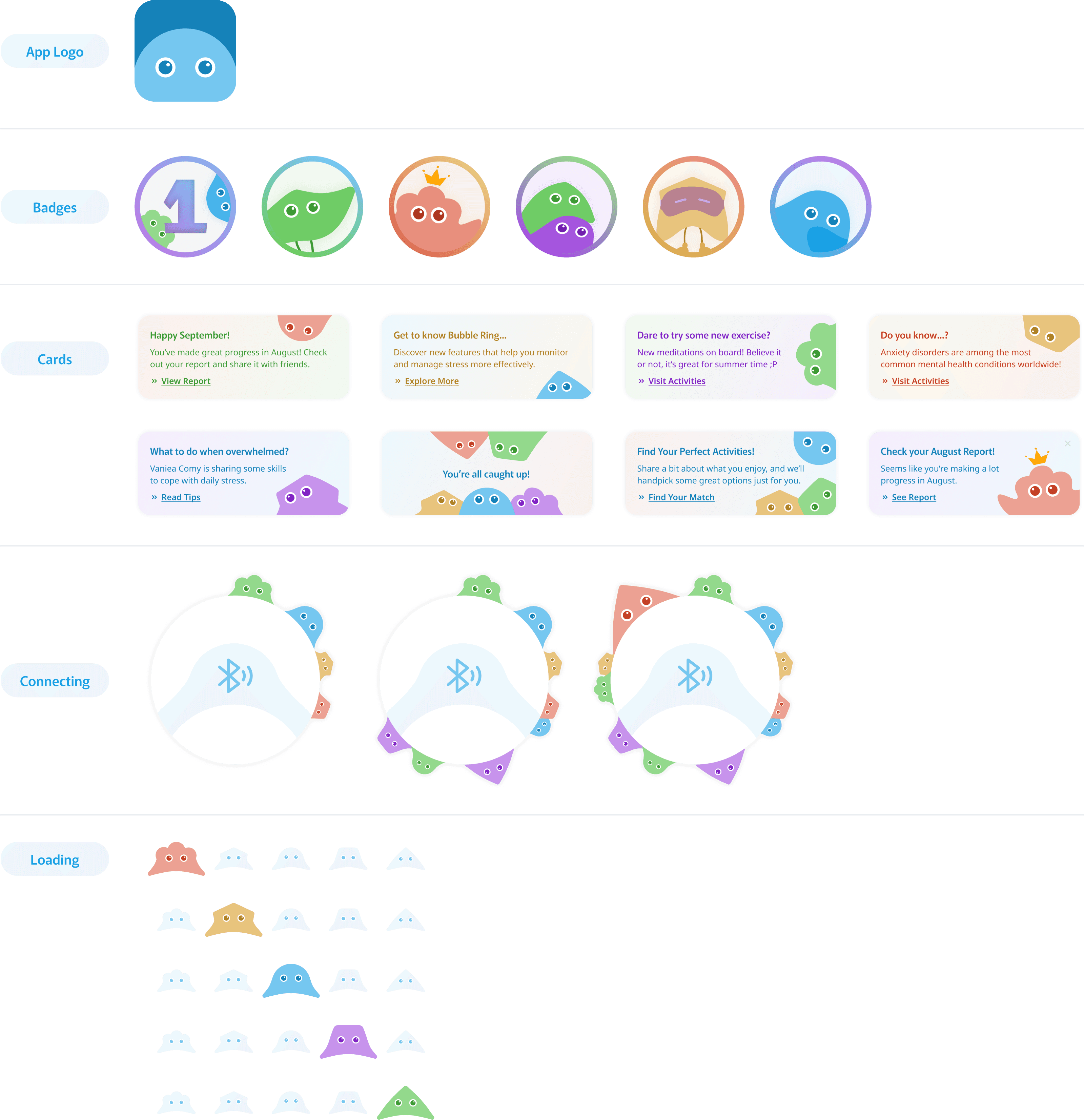
Our MELO app's interface seamlessly incorporates the personalized IP characters we designed to create a more engaging and interactive user experience. Each character plays a vital role in different sections of the app, bringing a touch of personality and a sense of connection to the user journey.

Our personalized IP characters are integrated throughout the MELO app to enhance user engagement and create a cohesive experience. From the app logo that embodies the brand's identity to the badges that celebrate user achievements, each character adds a touch of playfulness and motivation. The cards feature these characters offering guidance, updates, and tips, making the user journey feel more interactive and supportive. Even in the connecting and loading screens, our characters keep users engaged, turning every interaction into a welcoming moment.
Through these thoughtful placements, our IP characters don't just serve as design elements but as companions in the MELO app. They guide, motivate, and celebrate with users, transforming each interaction into a more meaningful experience.
